FoodScout

How do you create a digital product that can be used during all phases of travel?
Foodscout
FoodScout is a mobile companion application for Lonely Planet designed to act as a complement to their existing travel guides. The app draws from local food recommendations from knowledgeable food scouts connecting travelers to foodies on the ground.
Role: I worked with a team of three designers to complete the user experience design for this iOS app which included research, personas, card sort, features & functionality, user flows and wireframes.
This project was completed through the summer MFA IxD program at SVA.

Approach
We began the project with research that then led to the conceptualizing of the final product. Since the project brief was open ended, the ideation process started with user research and the LonelyPlanet Ecosystem analysis.
We asked our users "How do you Travel?" allowing them to identify key pain points and wish lists that were to be addressed during the app UX process. Users sought unique travel experiences similar to those of locals. This information was hard to find and was highly valued.
DEFINING PERSONAS
User personas were gathered based on user surveys of the target audience. There were two targets: the backpacker (a budget friendly traveler) and the more experienced traveler. From the three key personas we focused on different phases of product use. Clara during pre-travel, Paul during travel and Morsi for post-travel.


UNDERSTANDING THE COMPETITION
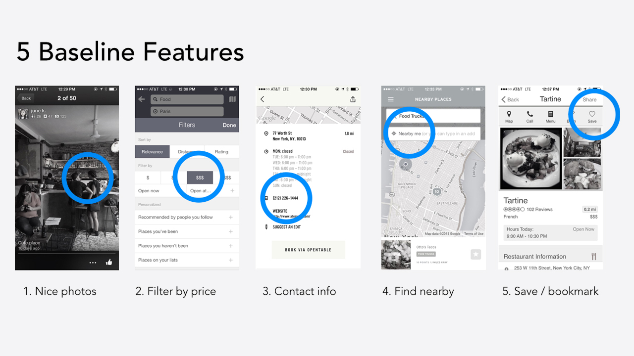
We conducted research on similar travel apps and food apps to establish baseline of features that would contribute to the definition of the minimal viable product (MVP). A lot of travel apps attempted to replace the travel book which went against the initial brief.
Our key conclusions were:
- Competitors have a lot of features which can be distracting to the users. It was better to define the MVP with a smaller scope and release more features in future updates.
- There were not many apps that supported offline map features, an element users were interested in.
Features & Functionality
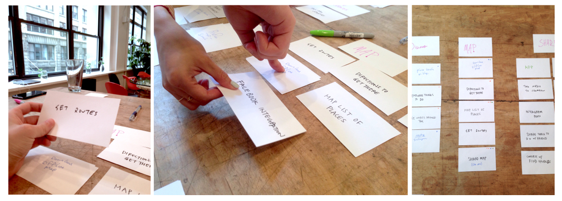
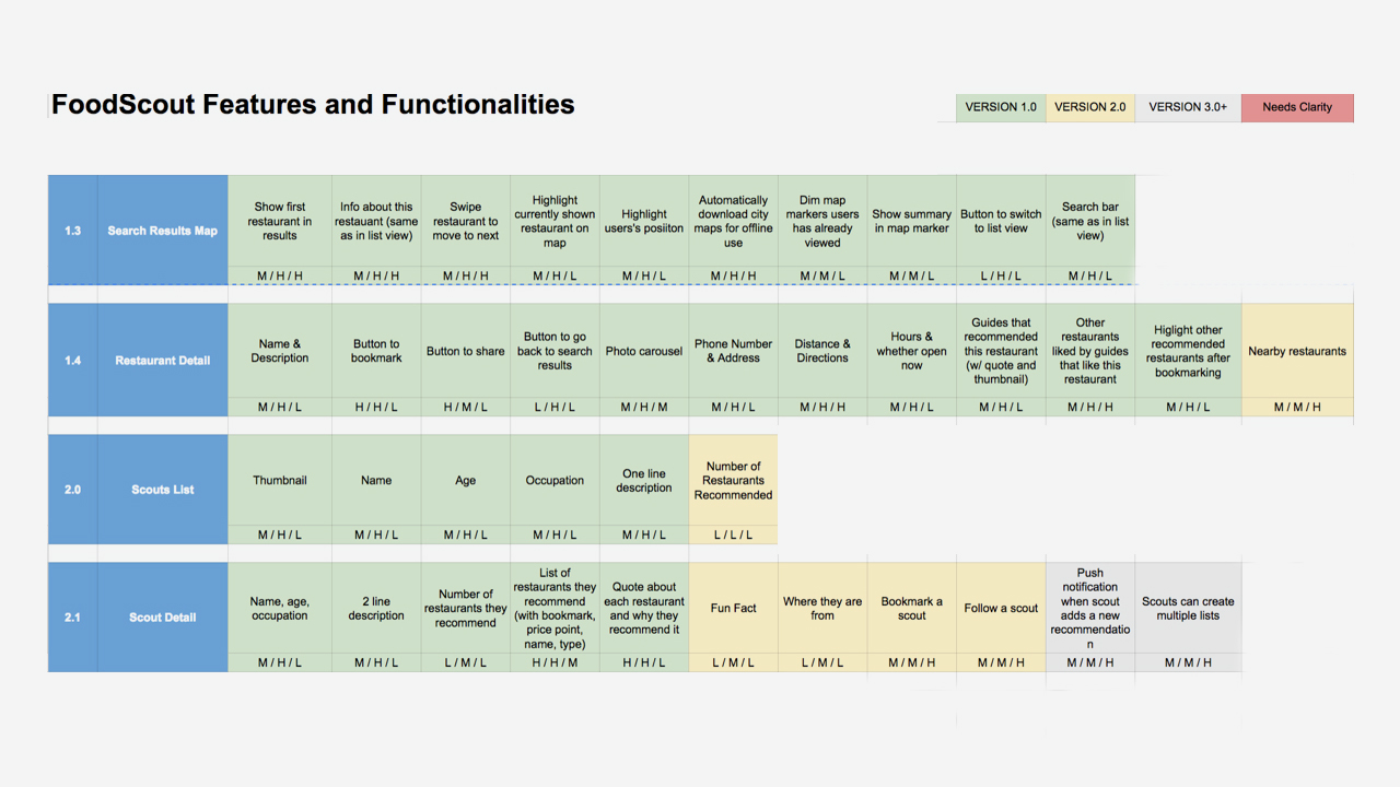
The definition of the features and functionality started with a card sort which helped define the main categories of content and interactions. We used the competitive baseline and business and user requirements to rank each function and feature taking into consideration relevant technical complexity. This allowed us to identify features that will be prioritized for the MVP as well as for any future roll outs. The product would start with 20 major cities for feasibility of roll out.

USER FLOWS
Key user flows were identified based on the three primary personas. With different priorities and motivations, each Persona had different behavioral patterns between planning level and app usage pre-, during and post-travel. This allowed us to validate the MVP and fill gaps.


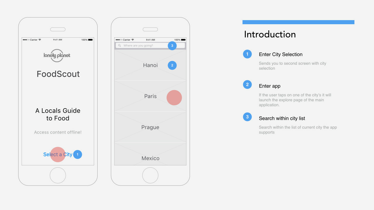
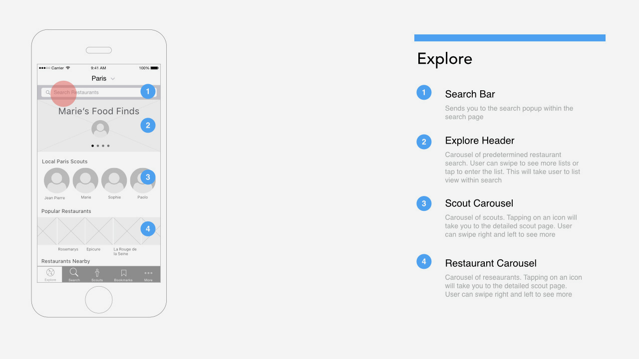
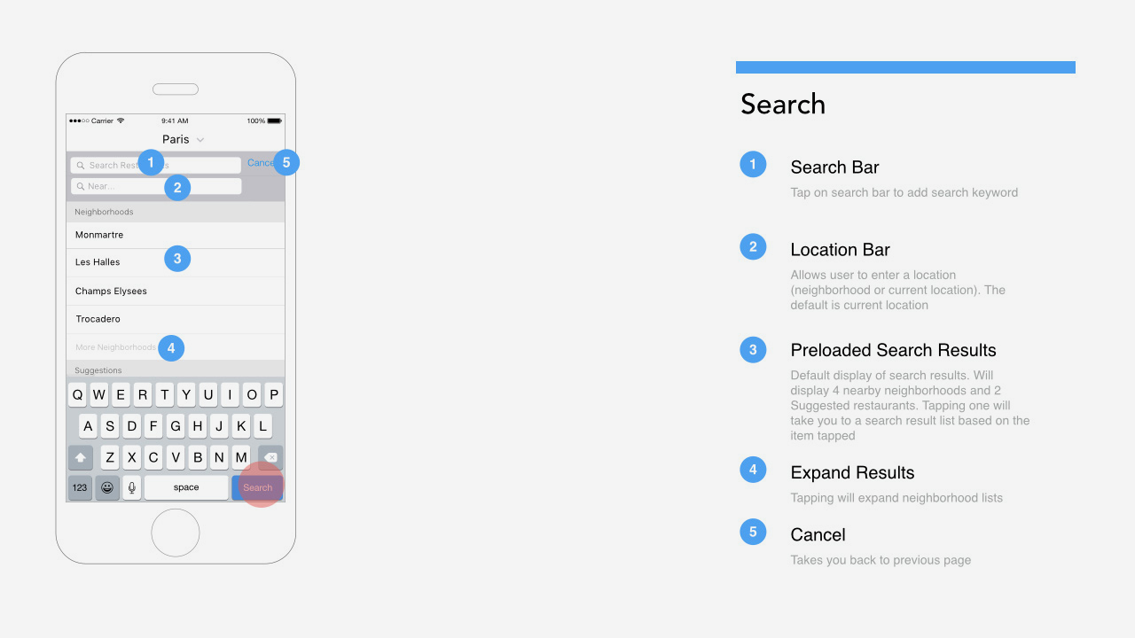
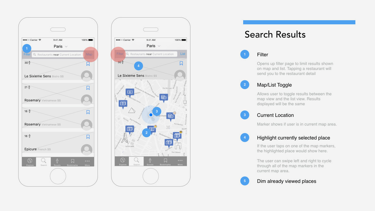
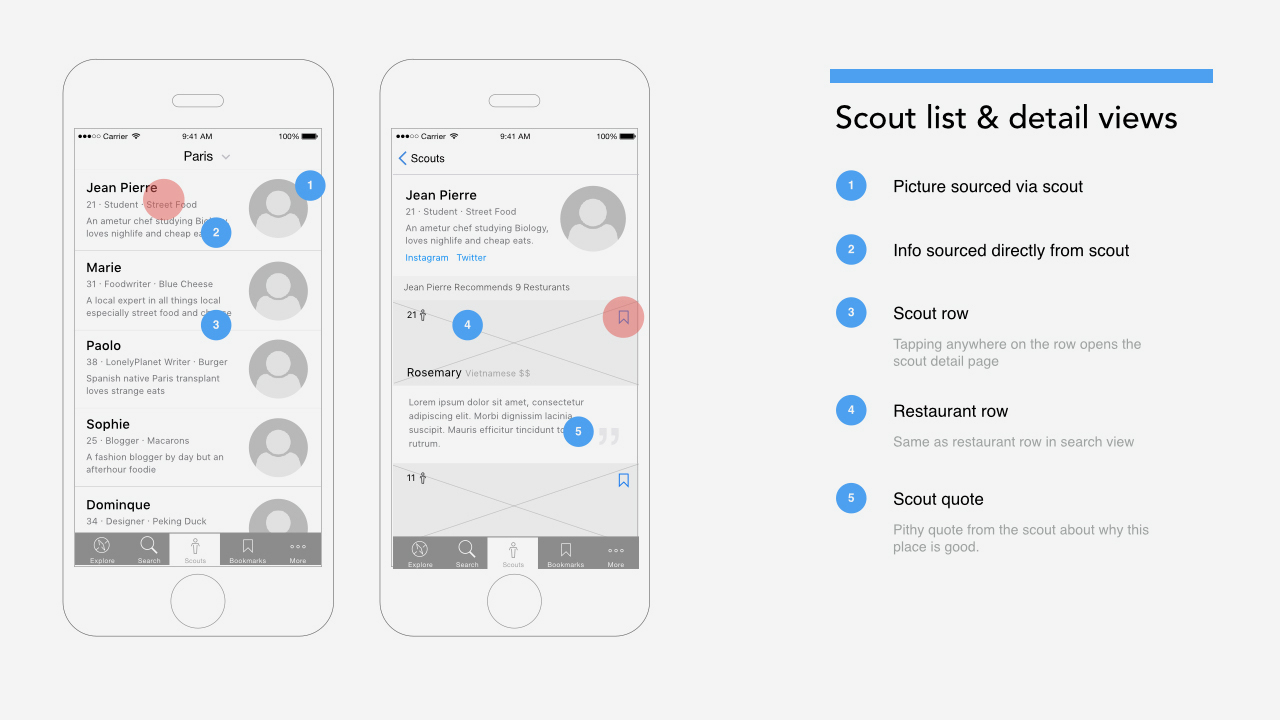
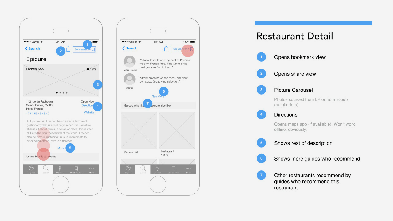
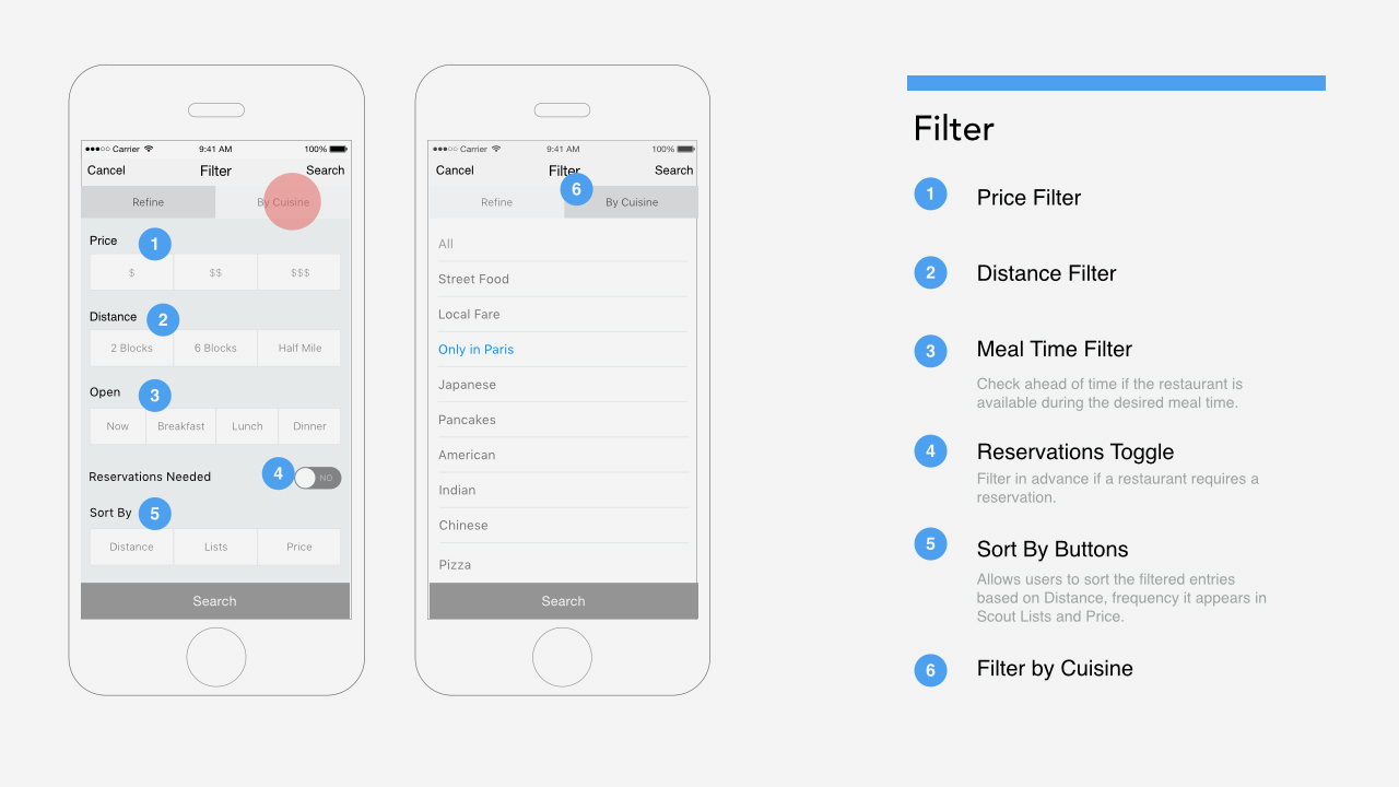
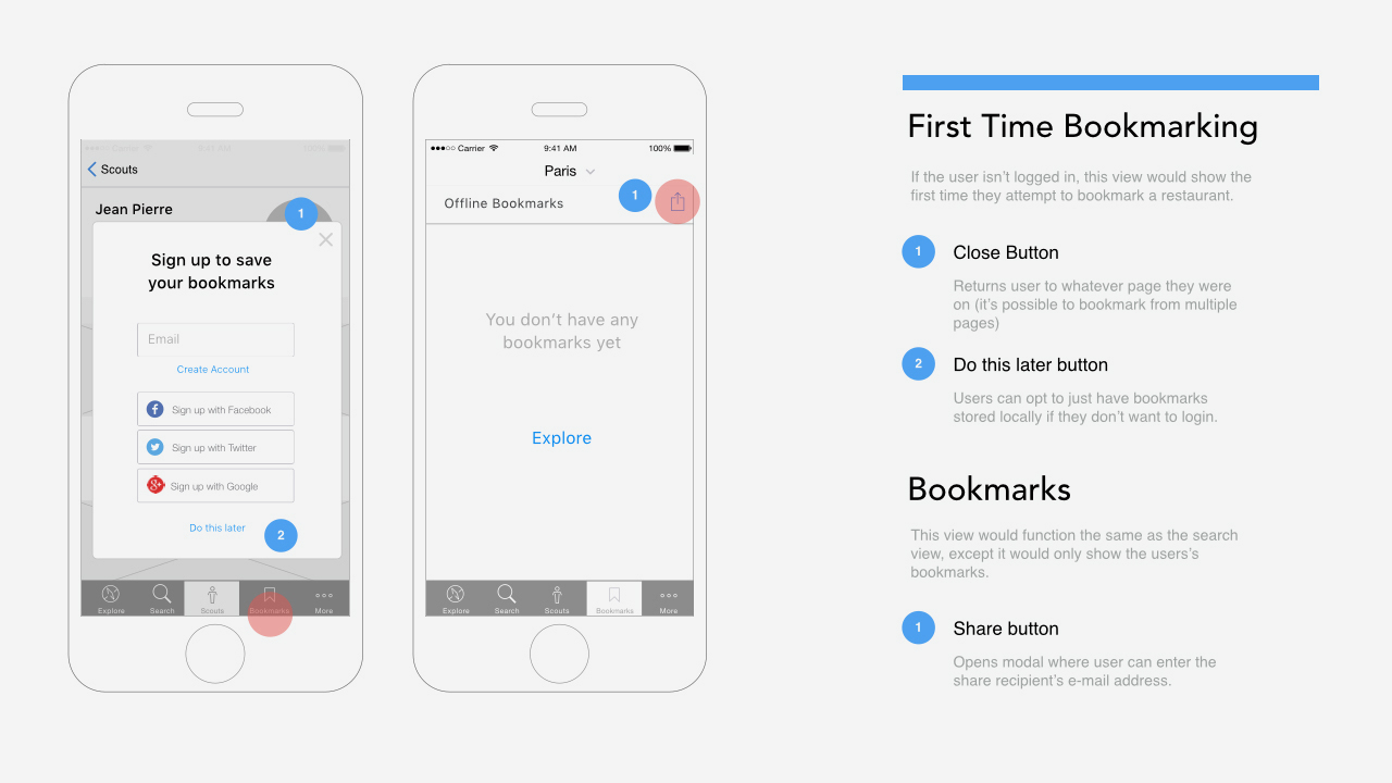
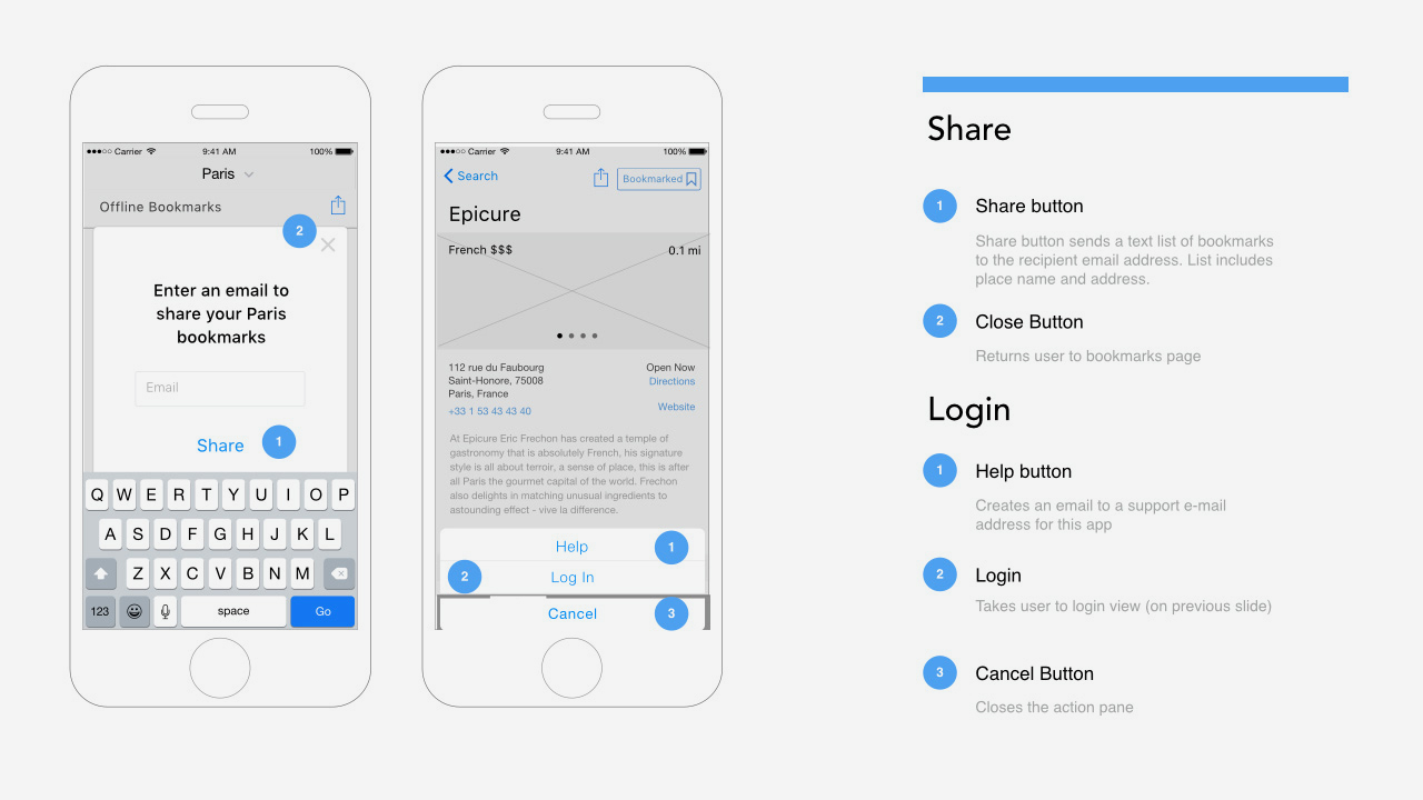
wireframes
The wireframes outlined the main views and functionality determined for the launch product. Each user flow and priorities were addressed. The prototyping session allowed us to validate the MVP assumptions. Several features were pushed to a future phase of the product.